Monday, 30 October 2017

Feedback on Mock Video


From feedback is was said that the 'bedroom' location for my music video wasn't successful and that I needed to add more performance with a more unusual background.


To amend this I will film the lip-synching in a fully white room at my school and edit visual effects over the lip-synching.


I have a public woodland area near my house which is easy to get to so I will add lip-synching shots with my artist using the trees as a background. I will also add landscape shots of the trees and non-lip synching shots to add variety to the shots in my video. I will also have the male actor feature in the shots with my artist to still keep the storyline that was from the mock music video.


Friday, 13 October 2017

Filming Schedule for Mock Video

October

16th - 21ist (half term) Holiday In Spain

I have a week to film the 'Holiday' sequences for my video, this is achievable as the 'Holiday' sequences make up only a third of the video and the male actor and the girl playing my Artist for the video will be coming to Spain with me. This means we will get all the filming done easily as the locations for the 'holiday' sequence will be easily accessible  to go to during our time in Spain.


22nd - 23rd editing of the 'holiday' sequences


24th - 25th filming Lip-Synching and narrative shots in house

I will film my artist singing the lyrics in my bedroom as a background, I will also have the male actor available to film the narrative in the house with the artist.

26th - 28th Editing

Tuesday, 10 October 2017

Magazine Advert Analysis 1


Magazine Advert Analysis 2


Magazine Advert Analysis 3

Digipack Anaylsis 1

I like the colour scheme of the image as well as the font of the album title as it is simple and 'clean.' I also like it how the image is a extreme close up of the artists face as it is a different design style that I haven't  seen before.

I like it how the inside-left image follows the same colour theme as the cover image and how in this image the eyes of the artist is open and on the cover they are closed. I like it how the disc follows the same 'rose' theme as the inside-left image which is visually pleasing. 

I like the back image as I think the filter follows the same colour scheme as the cover image and the inside-left image which adds correlation to the digipack. I like it how the song titles are on the right and the image is on the left as it creates a 'clean' layout.

Digipack Analysis 2

I like the greyscale effect the cover has as it fit well and correlates with Rihanna's 'edgy' theme of the songs in the album. It is a clever design element how they includes a 'R' in the corner which acts as a logo for Rihanna.

I like the abstract image on the inside-left as it adds a artistic element to the digipack and it fits in with the greyscale design of the front cover.

I like it how the song titles are on the left and the image of the artist is on the right as it is visually pleasing on the eye. I also like the image of Rihanna turning to look behind her as it fits in with the layout of the Digipack as the ismage is being used for the back of the album.


Digipack Analysis 3


 I really like this cover as the digital effect works well with the colour scheme.
I like it how the artist is facing away from the camera as it stands out from other CD covers where the artist is always looking towards the camera. I really like the font as well as it fits the title of the album as the letters look like they are glowing and neon. 


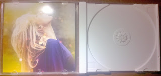
I like the inside-left picture as it has the same effect and colour scheme as the cover image so it acts like a theme which is visually pleasing. I also like it how she is looking away from the camera which correlates to the image on the cover as the artist is looking away also.

I like it that because the disc is yellow, it fits in with the theme of the cover image and the inside-left which I think is a cleaver design element. 

I like it how the song titles and barcode are centred as it looks very tidy. I also like it how the background has the same design effect and colour scheme as the cover and inside-left image.

Note To Examiner

Thank you for looking though my A2 coursework blog. I hope you enjoy looking at my media products and how they have developed though my rese...